CSS Classes Available
## General Components
.ck-style ## applies to everything
.ck-modal ## the embed pop-up
.ck-background-overlay ## the partially transparent overlay
.ck-step ## a wrapper around all content

## specific steps in flow
.ck-pause-step
.ck-discount-step
.ck-contact-step
.ck-redirect-step
.ck-survey-step
.ck-freeform-step
.ck-confirm-step

## while a customer subscription is being modified
.ck-progress-step

## once flow is complete - after discount, pause, cancel
.ck-complete-step

## if error is shown at any point (hopefully customers will never see this)
.ck-error-step

## Step components
.ck-step-header
.ck-step-header-text
.ck-brand-image
.ck-brand-image-header
.ck-step-description-text
.ck-step-body
.ck-step-footer

## Button variations
.ck-button
.ck-text-button ## custom color
.ck-black-text-button
.ck-primary-button ## custom color
.ck-black-primary-button
.ck-gray-primary-button
Example CSS Override
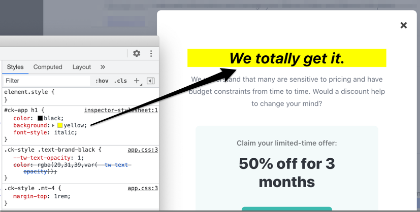
For simplicity, assume you want to modify the header text's appearance. The following CSS rule uses the top-level embed id and targets the specific element that needs styling.
#ck-app h1 {
  color: black;
  background: yellow;
  font-style: italic;
}
Here's how that looks in Chrome dev tools.
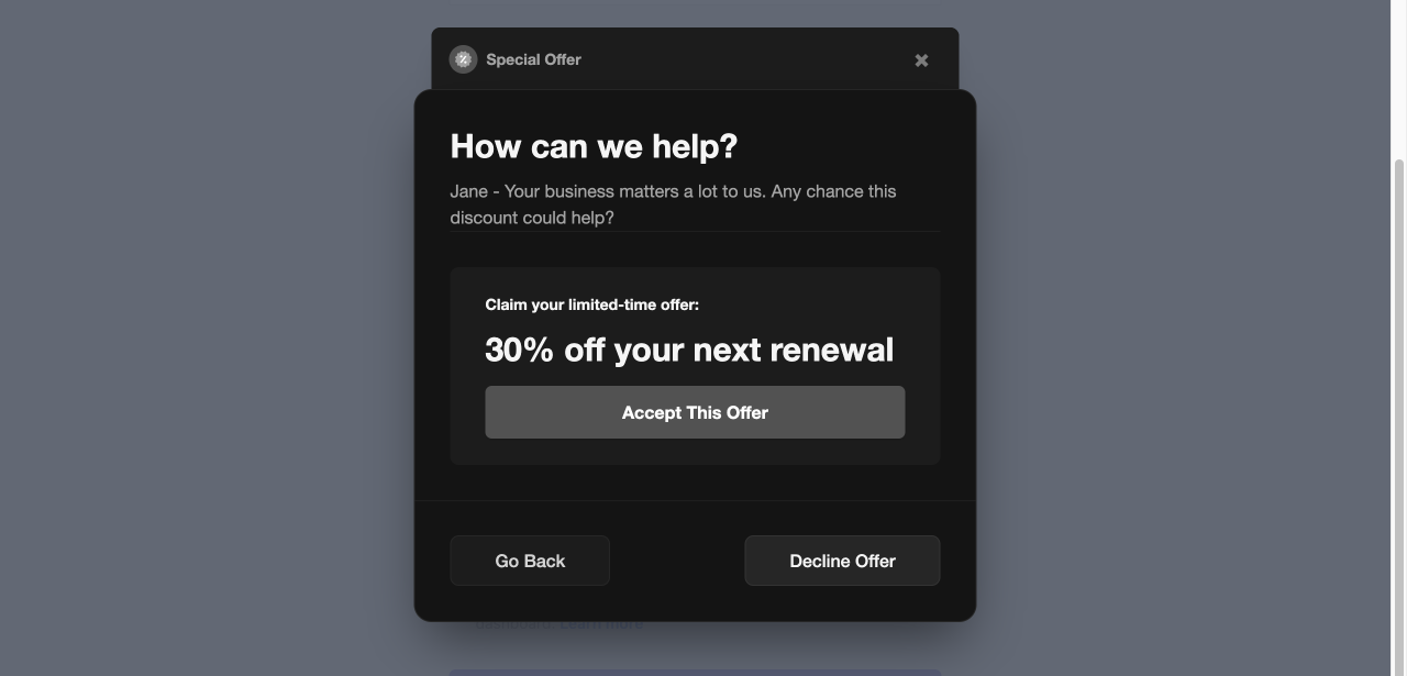
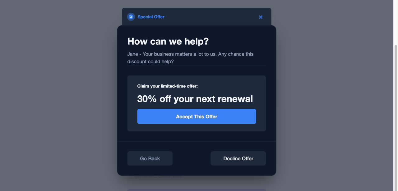
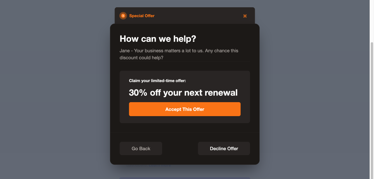
Ready-Made CSS Templates
Copy and paste these templates to quickly style your Cancel Flow. Each template covers the modal, form elements (dropdowns, inputs, textareas), buttons, text colors, and info boxes.
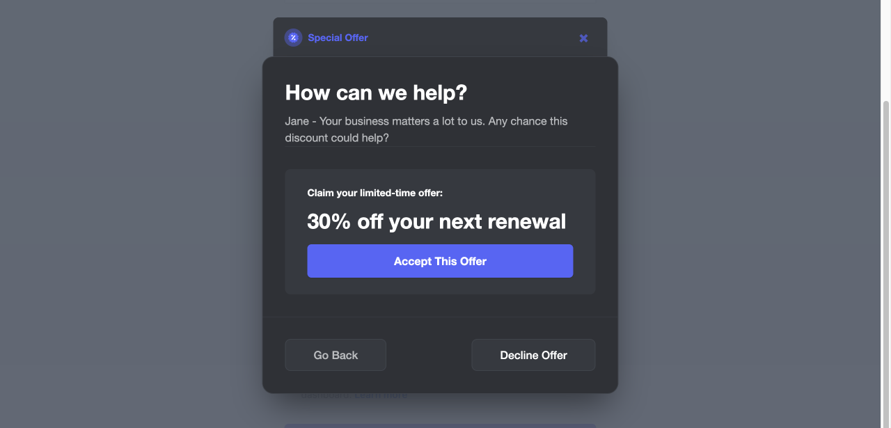
Dark Obsidian
Inspired by leading developer deployment platforms — pure neutral dark.
Dark Midnight
Inspired by a global payments infrastructure — cool blue-tinted dark.
Dark Ember
Inspired by popular team knowledge bases — warm dark with amber undertones.
Dark Blurple
Inspired by the world's largest real-time community platform — elevated dark.
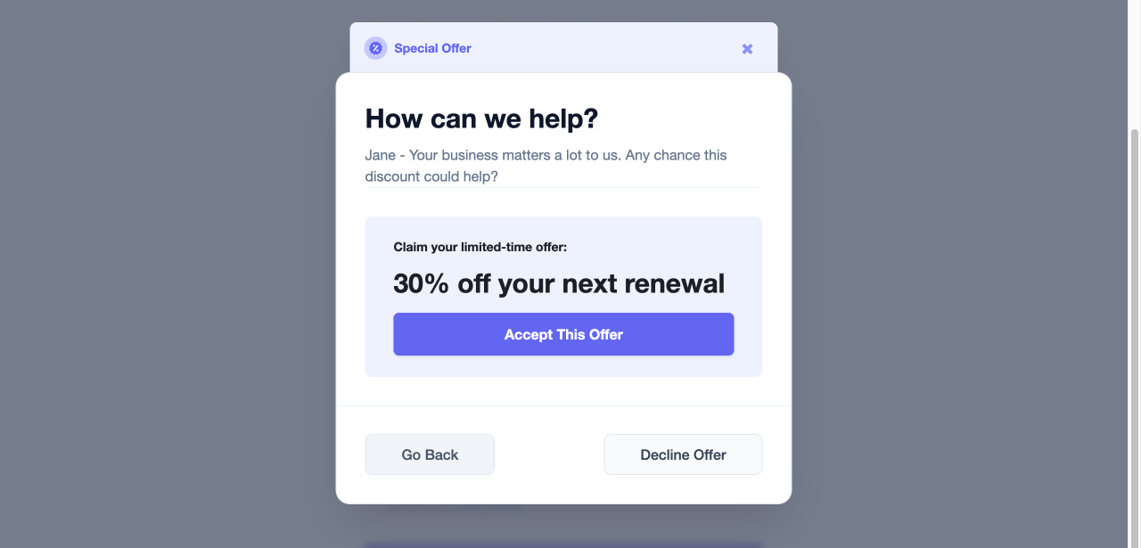
Light Clean
A polished light theme with soft borders and subtle shadows.
Building Custom Dark Themes
html body #ck-app selectors for specificity. They also override .text-brand-black, .text-opacity-*, and [class*="bg-client-primary-light"] for dark background legibility. If you build a custom theme, include both the brand color overrides and the text color overrides sections or elements may remain in your dashboard's default brand color.Quick Implementation Guide
Add one of the templates above to your site by injecting a <style> tag anywhere on the page where the Churnkey embed loads. The CSS will automatically apply to the Cancel Flow modal.
<style>
  /* Paste your chosen template CSS here */
</style>
Using an AI coding assistant
If you use an AI coding assistant (Claude Code, Cursor, Copilot, etc.), paste the following prompt to have it wire up the CSS for you:
I need to add custom CSS styling to my Churnkey Cancel Flow embed.

Here is the CSS template I want to apply:

<PASTE YOUR CHOSEN CSS TEMPLATE HERE>

Instructions:
1. Find where the Churnkey embed script loads in my codebase
   (look for `churnkey.init`, `assets.churnkey.co`, or `window.churnkey`).
2. Add a <style> tag on the same page, BEFORE the Churnkey script,
   containing the CSS above.
3. If my app uses a framework (React, Vue, Next.js, etc.), inject
   the styles using the idiomatic approach for that framework
   (e.g., a global stylesheet import or a <style> block in the layout).
4. Do not modify the Churnkey embed script itself.

Reference docs: https://docs.churnkey.co/cancel-flows/custom-styling